
Configuration
1. Add new section and setup
This is very important for the module to work properly.
You need to create a one-column section and remove all margins. Besides that, you must give a full width to the section. All these settings can be done from the styles tab, selecting the new section.


Don't forget to choose the background color for the section
2. Add GRADIENT HERO by HAL Company
In the "add modules" section you must search for Gradient Hero with and then drag and drop the module into the new section we have made in the previous step.

3. Set Background Image
You can select an image to use as a background in Gradient Hero. Just select it from your library, upload it from your device or you can generate it with HubSpot's tools.

4. Set Title and Text
Here you can enter the title of your Gradient Hero and the text you will present. Remember not to use long titles and text so that the content can be adapted efficiently to each device.

5. Side Image
If you wish to add an image to your Gradient Hero, you must enable this option. Remember that this option is not available for mobile devices.

Once "Side Image" is enabled you will be able to load the image, configure the place where you want it to be placed (Left or Right), and the alternative text for accessibility.

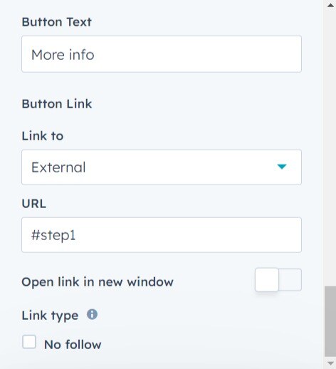
6. CTA
If you wish to incorporate a call-to-action button in your Gradient Hero, you will need to enable this switch.
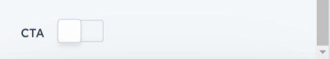
Once enabled, you will be able to configure the button text, the link type and the classic options to open in a new tab and the link type.
Style
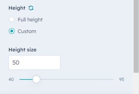
1. General
First you can define if you want a Gradient Hero to fill the entire height, or if you want to define your own.

Select the "Custom" option to define the module height and slide between the values 40 and 95 as needed.
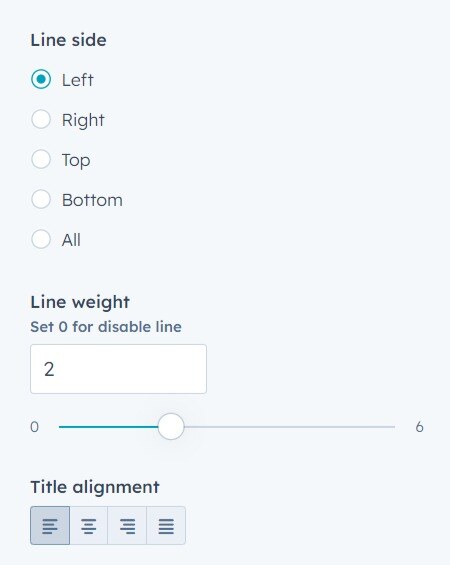
2. Text Settings
Here you can adjust the size of the title, the color of the textual content, the color of the border line and its location as well as the thickness of the border.
The alignment of each element can be done here.


You can also assign animations to each element.

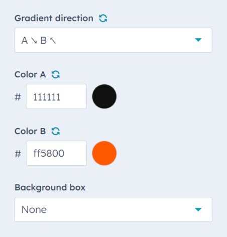
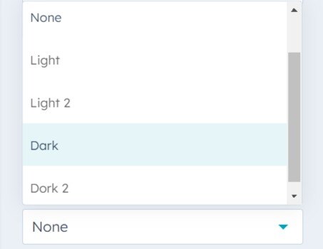
3. Background Settings
First we must set a background color for our module, because if we don't select an image when setting our Gradient Hero, this color will be used between Gradient. Also, you can choose which overlay to use so that the content can be further distanced from the background.

This is the place to select the colors for the gradient and the direction you want to use.
If you want your text container to have a translucent effect, you can configure it here
4. Button Styles
Customize the CTA with your brand colors. Remember also to assign the colors for its hover effect and finally assign an animation and the button alignment.


5. Image Animation
If you have used an image in your Gradient Hero, you can give it an animation from here.

